

Dear all,
4 + 1 cherry picked Maverick Charts of the week say 10,000 words or more = the ‘How’!
Table of contents = the ‘What’! Executed in a succinct manner with the aim of a high density of ideas, because great research respects the reader’s time:
📊 Maverick Charts: Air Travel, Food Affordability, Minimum Debt Payment
📊 Bonus: Corporate America Profit Margins
Objective: both data-driven insights + valuable food for thought = the ‘Why’!
📊 Maverick Charts: Air Travel, Food Affordability, Minimum Debt Payment 📊
The U.S. Economy in Real-Time through a sleek high frequency data point that everyone participates in, but rarely knows how good or bad it is: Air Travel as a good proxy for all the Consumers’ big 3: Income, Sentiment and Mobility!
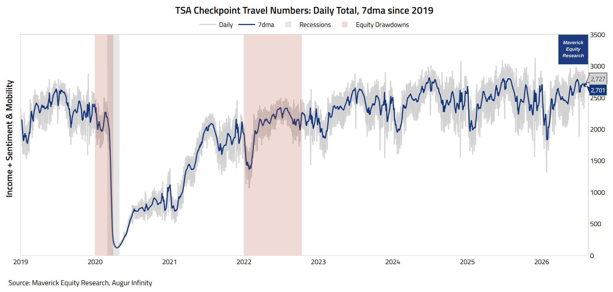
TSA Checkpoint Travel Numbers, daily total & 7dma since 2019 + recessions (grey shaded) + bear markets (redd:
👉 2,727 million travelers (grey) = a solid reading via the latest fresh number from just 2 days ago, 3rd of August
👉 2,701 million travelers (blue) is the 7-day moving average: also a solid reading!
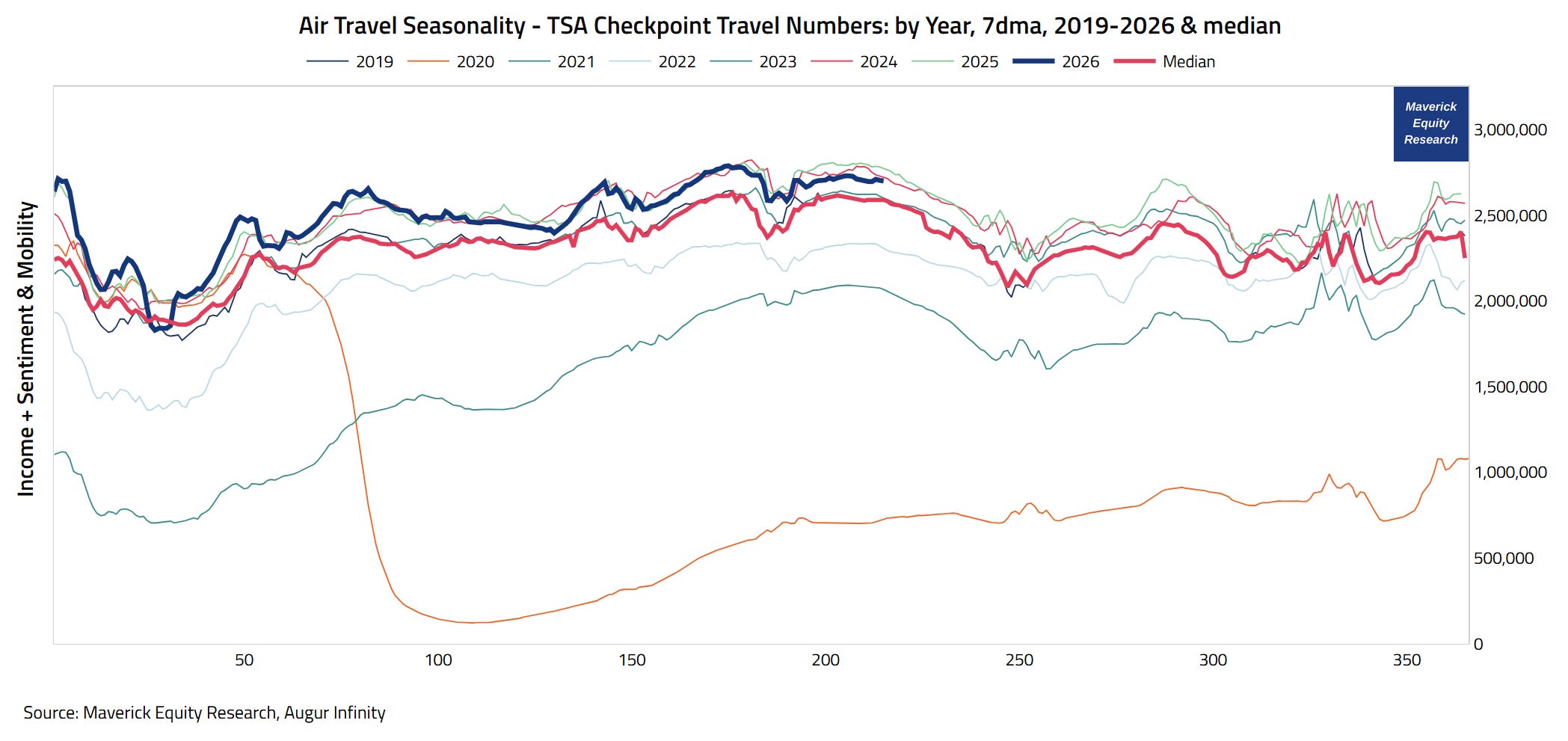
TSA Checkpoint Travel Numbers, by Year, 7dma, 2019-2026 & Median, as a complementary view in order to capture Air Travel Seasonality Dynamics:
👉 2026 (blue) with 2.725 million daily passenger screenings (as a 7-day moving average) way above the 2.632m median (red) = a solid reading also from this angle!
👉 above or around record levels for a decent part of 2026 — great numbers!
Takeaway on Air Travel given the correlation with the business cycle:
We can infer that the economy is currently doing quite well, and that despite all the negative headlines, especially the latest ones regarding Iran, related very volatile oil prices and overall Geopolitical issues (and you name it).
Overall, a positive/bullish sign given that naturally this type of data is a decent proxy for income, sentiment & mobility!
Food Affordability — what about this hot topic? You might have seen this chart:
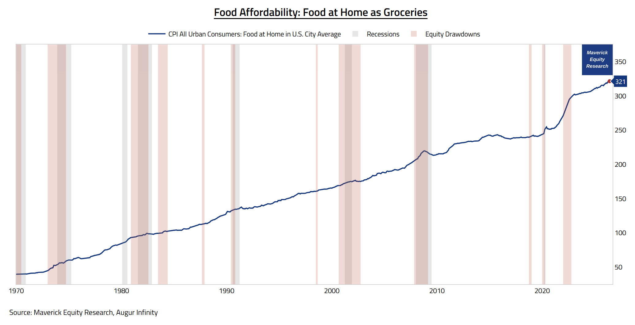
3. CPI for All Urban Consumers: Food at Home in U.S. City Average since 1970 as a great (if not the best) proxy for grocery prices:
👉 it trends higher in time, and once with Covid 2020 it kicked into a higher gear
👉 not fun, right?
Yet, check this one out:
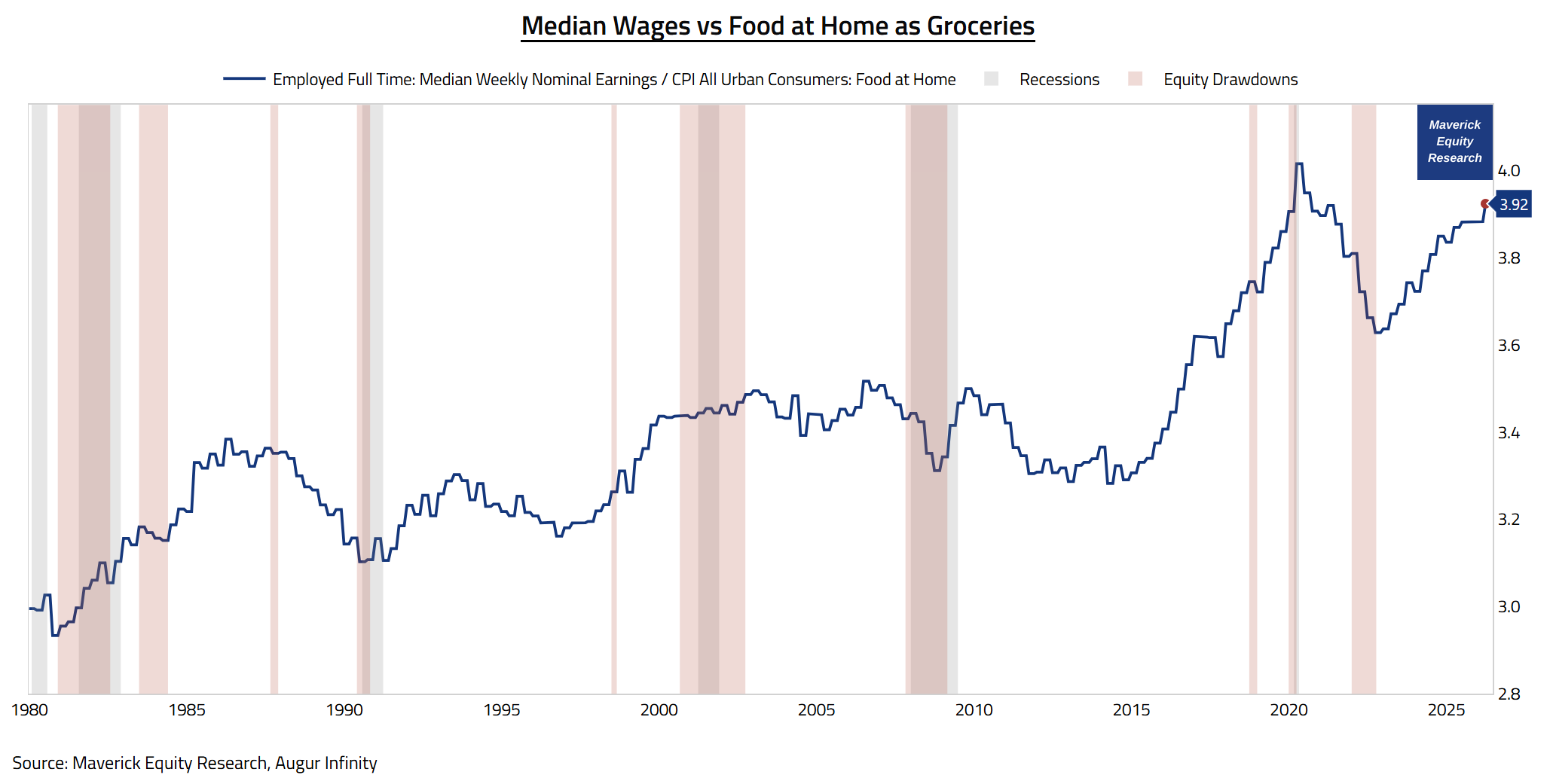
Median Wages divided by CPI Food at Home in U.S. City Average since 1980
👉 at 3.92 we get a completely different picture: higher affordability! (using median values for wages is key as the average is quite misleading/silly)
👉 actually, grocery prices are the most affordable they've ever been — note:
I strictly refer on a median basis — it is likely the bottom 10-20% of the population does unfortunately suffer from inflation in general, and as well the key Food inflation (one day I will dig into the data and show also how that looks)
you can ignore the 2020 higher peak as that was a big outlier: back then median wages shot up temporarily due to the compositional effects of low-wage workers getting laid off disproportionately
Takeaway:
Nominal grocery prices are and should NEVER going back down — unless we have a severe deflation which nobody wants to have actually (trust me).
Yet, especially since 2015 stuff become more affordable through wages rising faster than prices, which is exactly what has been happening.
You know what they say, going out is cool, but nothing beats a home-cooked meal!
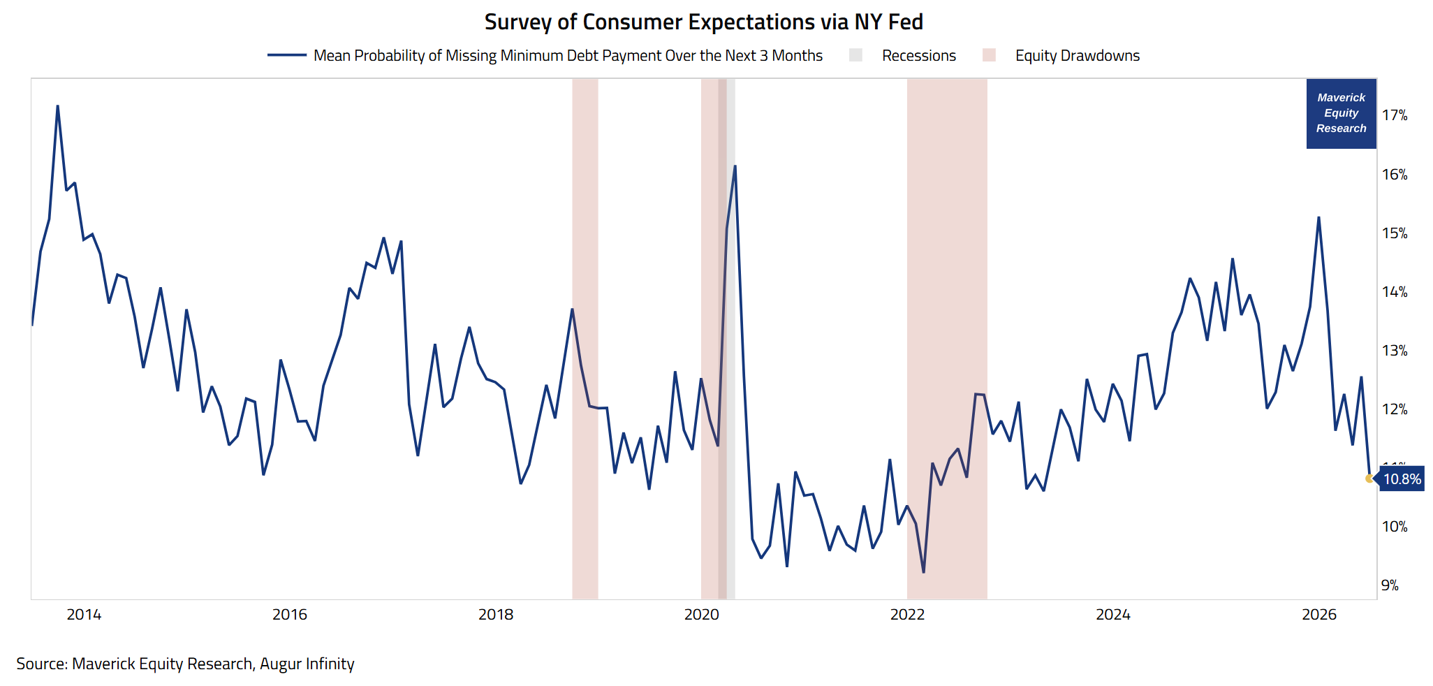
Mean Probability of Missing Minimum Debt Payment Over the Next 3 Months through the NY FED Survey of Consumer Expectations:
👉 10.8% with a big drop in 2026 from 15.3% — a lower share of consumers with a negative outlook on this key payment points to easing financial stress for households
Takeaway:
At the lowest level since 2023, a sign of confidence from the households which are feeling better about their finances.
📊 Bonus: Corporate America Profit Margins 📊
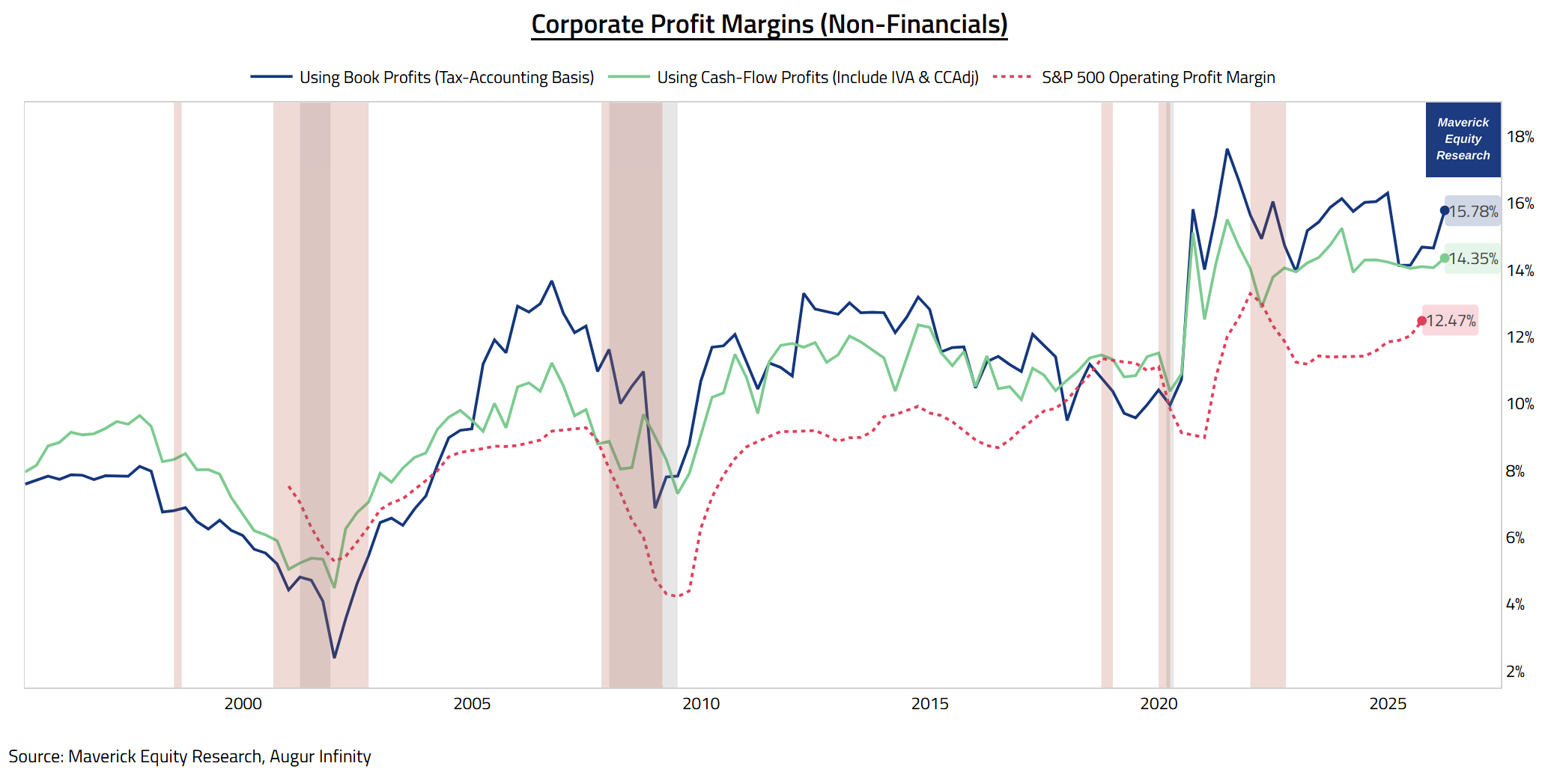
‘Maverick, how are profit margins in the entire Corporate America doing?‘ via BEA, both overall (excluding financials) + the S&P 500 (including fins) for 10,000 words:
👉 both are doing very well, trending higher:
15.78% (tax accounting basis, blue) and 14.35% (cash-flow basis, green) overall
12.47% (red dotted) for the mighty S&P 500 big caps
👉 note how materially they are above both the 2019 pre-pandemic times and the 2006 pre-Lehman/GFC times when they bottom at 4.21% for the S&P 500 (hence a 3x to today), 6.86% on the tax accounting basis (hence a 2.3x), and 7.3% on the cash flow basis (hence a 2x to today)
Takeaway;
Corporate America keeps doing its thing — up and to the right!
2 further complementary notes to cover F.A.Q. on this key comprehensive chart:
S&P 500 profits & BEA profits are correlated (correlation > 0.8), yet differences exist due to coverage, accounting methods, and industry representation
BEA corporate profits data include the profits of S&P 500 companies as part of the broader universe of all U.S. corporations, but the BEA figures are more comprehensive and reflect the entire corporate sector, not just the S&P 500 index
P.S. way more on the U.S. Economy via my 2 key deep dives for both Top-Down & Bottom-Up approaches, in essence connecting the mighty Macro-Finance bridge:
✍️ The State of the U.S. Economy in 75 Charts = A Deep Dive! ✍️
The report breaks down the U.S. economy and ultimately aims to answer two of the biggest questions in Finance and Economics:
“How are the Fundamentals of the U.S. Economy?“
“What is the Probability of a Recession?”
✍️ Decoding the U.S. Economy in Real-Time Through Sleek High Frequency & Alternative Data ✍️
decoding the U.S. Economy by looking way beyond the traditional economic metrics, namely, through the lens of real-time, high frequency & alternative data!
in essence, a ‘live’ view on the state of the U.S. Economy, and quite a unique report which you do not see elsewhere!
a sharper and timely way to understand the macro forces shaping investing and overall financial markets!
Maverick Charts 59th edition done, 4 key charts with many insights + 1 Bonus!
You can check all the previous 58 editions in the Maverick Charts section!
Mission accomplished for me if the following resonates with you:
‘Hmm I never thought it that way’, ‘now that chart said a whole lot’, ‘now that chart was really interesting’, ‘now that is something new’, ‘now I got it!’, ‘you managed to turn something complex into something actually simple’
hence, if you got to see something differently, my approach gave you a different angle, it did help you connect your key dots, then we all do well here!
Research is NOT behind a paywall and NO pesky ads here unlike most other places!
Did you enjoy this by finding it interesting, saving you time and getting valuable insights? What would be appreciated?
Just sharing this around with like-minded people, and hitting the 🔄 & ❤️ buttons!
That’ll definitely support bringing in more & more independent investment research: from a single individual … not a corporate, bank, fund, click-baity media or so … !
Like this, the big positive externalities become the name of the game! Thank you!
Sharing = 3x win: you + your close ones + me!
Have a great day! And never forget, keep compounding: family, friends, community, capital, knowledge, research and mindset!
With respect,
Mav 👋 🤝
“Compound interest is both the ultimate and biggest natural hedge!”
Maverick Equity Research

Great article!