
✍️ Big Tech, Semis, AI Gold Rush, S&P 500 Valuation, Germany DAX & Swiss Stocks = Maverick Equities Charts of the Week #46
12 Maverick Charts that say 10,000 words

Dear all,
12 cherry picked Maverick Charts of the week say 10,000 words or more = the ‘How’!
Table of contents = the ‘What’ with the aim for a high density of ideas because the best respect the reader’s time:
📊 Maverick Charts: Big Tech Taking Over The World, Semiconductors, Hyperscalers AI Gold Rush, S&P 500 Valuation, Germany DAX & Swiss Stocks
📊 Bonus: U.S. ETFs massive inflows + Blackrock massive AUM
Objective: both data-driven insights + valuable food for thought = the ‘Why’!
📊 Maverick Charts: Big Tech Taking Over The World, Semiconductors, Hyperscalers AI Gold Rush, S&P 500 Valuation, Germany DAX & Swiss Stocks 📊
‘Tech is Taking Over the World, Baby!’ updated chart - Tech relative to the S&P 500:
👉 Tech sector (XLK) sitting relatively again way above the mighty S&P 500 (SPY): actually it jumped again above even the +2 Standard Deviations SD (red) ...
👉 way above the average (green) which was Pre-Covid 2020 - then during Covid it broke to +1 SD (orange) while it ran even above the +2 SD in the 2023 AI run, and now again with the AI 2.0 mega run
👉 Tech today = real = it works = big earnings and cash flow via cloud, infrastructure, AI = hence very likely NOT a 2000s style Dot-com bubble ...
Nonetheless:
👉 it’s hard to ignore the parabolic run lately, especially given relative to the S&P 500 which is not a shabby construct at all - I mean it is the big 11 sectors of Corporate America which also derives 40% of revenues from outside the U.S. (XLK/SPY ratio would be naturally even higher if from the SPY denominator we would take out XLK)
👉 overall quite a pricey market with a lot of future growth baked into the valuations = it’s a bit of a luxury problem to have after all, but still one shouldn’t get complacent: reassessing, trade-offs, and comparing other investment opportunity sets is still key!
👉 while some market pockets are very likely overcooked & overvalued

‘Semiconductors are Taking Over the World, Baby!’ updated chart also - Semiconductors relative to the S&P 500 with a similar story:
👉 2020 = broke above the +1 SD
👉 2023 = broke above further ... above the +2 SD via a parabolic run
👉 2025 = again above the +2SD via a similar parabolic style
Let that sink in … & ... food for thought(s) ... 😉

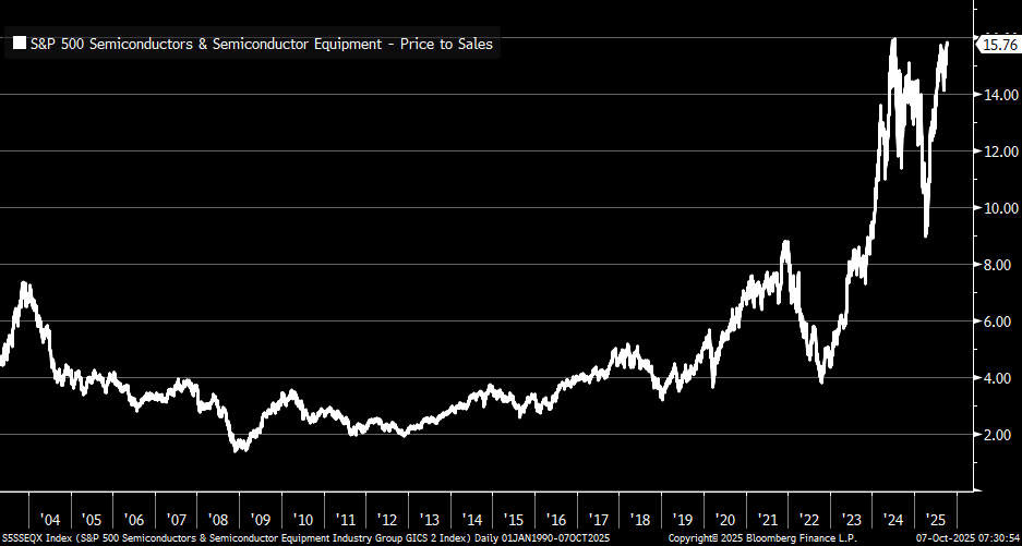
Looking at the Semiconductors valuation via the Price/Sales ratio:
👉 Industry Group at nearly 16x
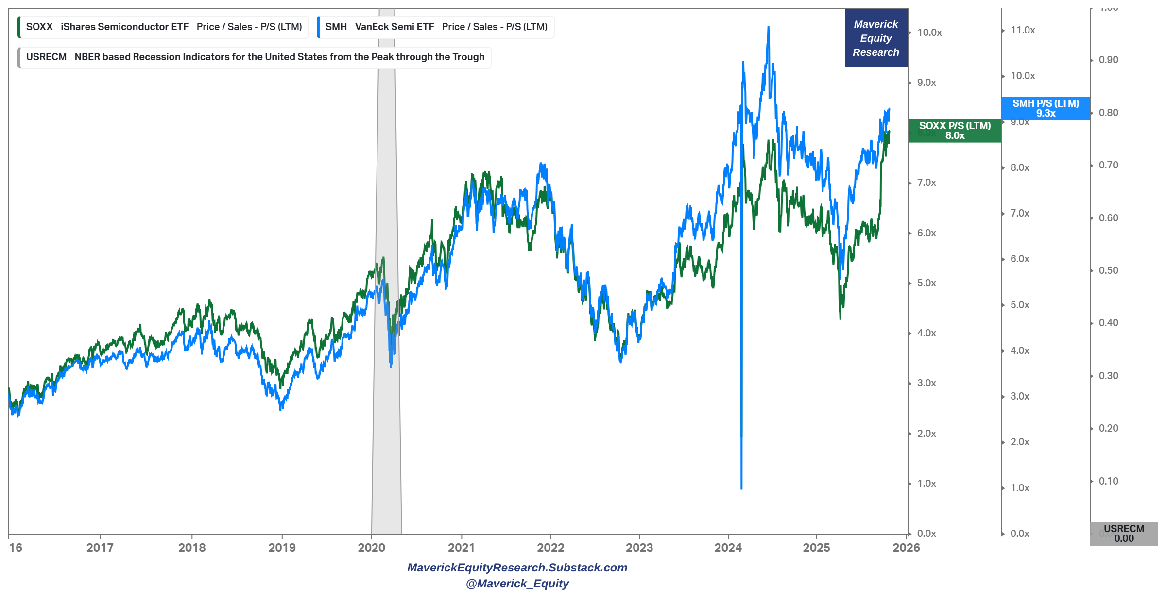
ETFs wise the Price/Sales ratio:
👉 SOXX (iShares Semiconductor ETF) = 8.0x
👉 SMH (VanEck Semiconductor ETF) = 9.3x
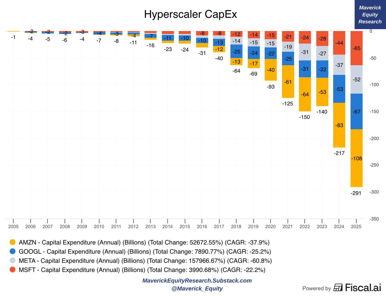
‘The AI Gold Rush’ via the Hyperscalers CAPEX (capital spending):
👉 Amazon, Microsoft, Alphabet, and Meta have spent almost $300 billion in combined capital expenditures over the last 12 months!
The big question when massive investing happens in any industry = ‘how can we know if it will lead to results, efficiencies, added value, hence also subsequent financial returns? ‘
typically investments happen big time and they do overshoot, then cool-off, likely a heavier correction (like a clean-up), while after the rebound comes where the good resulted outputs are carried forward
hence, how can one track when is it around the inflection point where more is not better, and actually wasted capital & financial losses might be around the corner?
I am working on my own 2 proprietary metrics/methodology to track this key one:
Maverick Computing Efficiency Index (MCEI) = a hard/quantitative indicator where computing power & deployed capital are combined in order to assess how good/bad the industries’ AI Gold Rush is yielding results (investment VS return)
Maverick AI multiple (MAIM) = a soft/qualitative indicator, a Price-to-AI multiple to gauge how hot, super hot, or cooling the AI thematic/trend actually is
Combining the 2 metrics will aim to give us a good gauge for where we are in the AI industry cycle, and how good/bad is AI translating investments into corporate returns.
This goes further with implications on Valuation of the sector, but also the market overall (S&P 500) given the big weight these companies have, and also across the entire U.S. Economy … hence, nowadays this is quite a material indicator. Most likely to be released in 2026 given that it is tricky to do + very time and data/costs intensive.
Moreover, to unpack all this with more rationale data and insights, I will do 2 dedicated Maverick Special reports:
✍️ Is the U.S. Stock Market in a Bubble? (Part II), you can read Part I here
✍️ Market Pockets of Overvaluation, Animal Spirits Behaviour and Bubbly Territory
Overall economy wise, way more via the next comprehensive & improved coverage:
✍️ The State of the U.S. Economy in 75 Charts, Edition #4
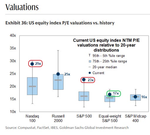
U.S. Equity Valuations vs History via the Forward P/E, a great overview:
👉 Nasdaq-100 = 29x = way above 20-year median, and in the 95th-5th %ile range
👉 S&P 500 (weighted) = 23x = way above the 20-year median, and off the chart in terms of the 95th-5th %ile range
👉 S&P 500 (equal-weight) = 17x = not much above the 20-year median, and around the 75th-25th %ile range = more decent valuation
👉 S&P 400 (Mid-Caps) = 16x = at the 20-year median, and well inside the 75th-25th %ile range = way more decent valuation
N.B. Mid-Caps & Small-Caps are the place to hunt for undervalued stocks, hence I will cover quite in details some names from that space via the dedicated section
✍️ Full Equity Research
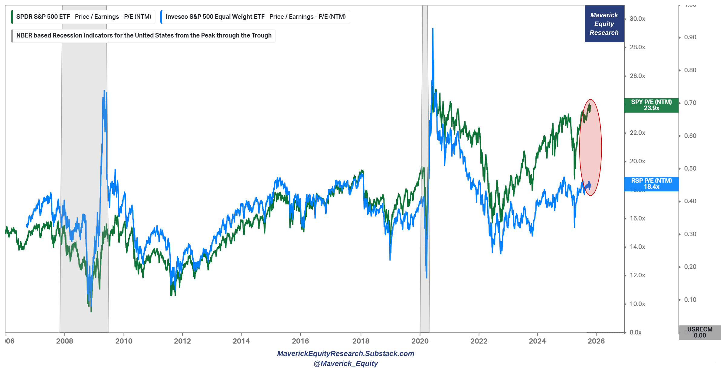
S&P 500 equal-weight vs/relative to weighted (RSP/SPY):
👉 statistical bands with the mean & standard deviations: now below even -2 SD ...

Valuation wise via the forward P/E = 23.9x vs 18.4x = gap becomes jaws like:
👉 the idea here is that valuations should converge sooner or later: currently the market is pulled up big time by the Mag 7 and/or Top 10 which are mostly Big Tech
👉 in the most bullish case = we should have a convergence, meaning ideally more earnings across all the 11 sectors - that is because AI efficiencies should be felt across the 11 sectors and the economy
👉 in simple terms: we can’t build, live, eat, travel, consume, innovate just online in the ‘cloud’ via clicks - the real economy shall get efficiencies & higher earnings also!
P.S. overall, from here going forward I am more bullish on the equal weighted S&P 500
For way more on the S&P 500, the 2 distinct & materially improved S&P 500 reports will cover a lot of ground and it will also answer how overvalued or not it currently is:
✍️ S&P 500 Report: Valuation, Fundamentals, Special Metrics & Leading Indicators
✍️ S&P 500 Report: Performance, Sentiment, Seasonality & Technical Analysis
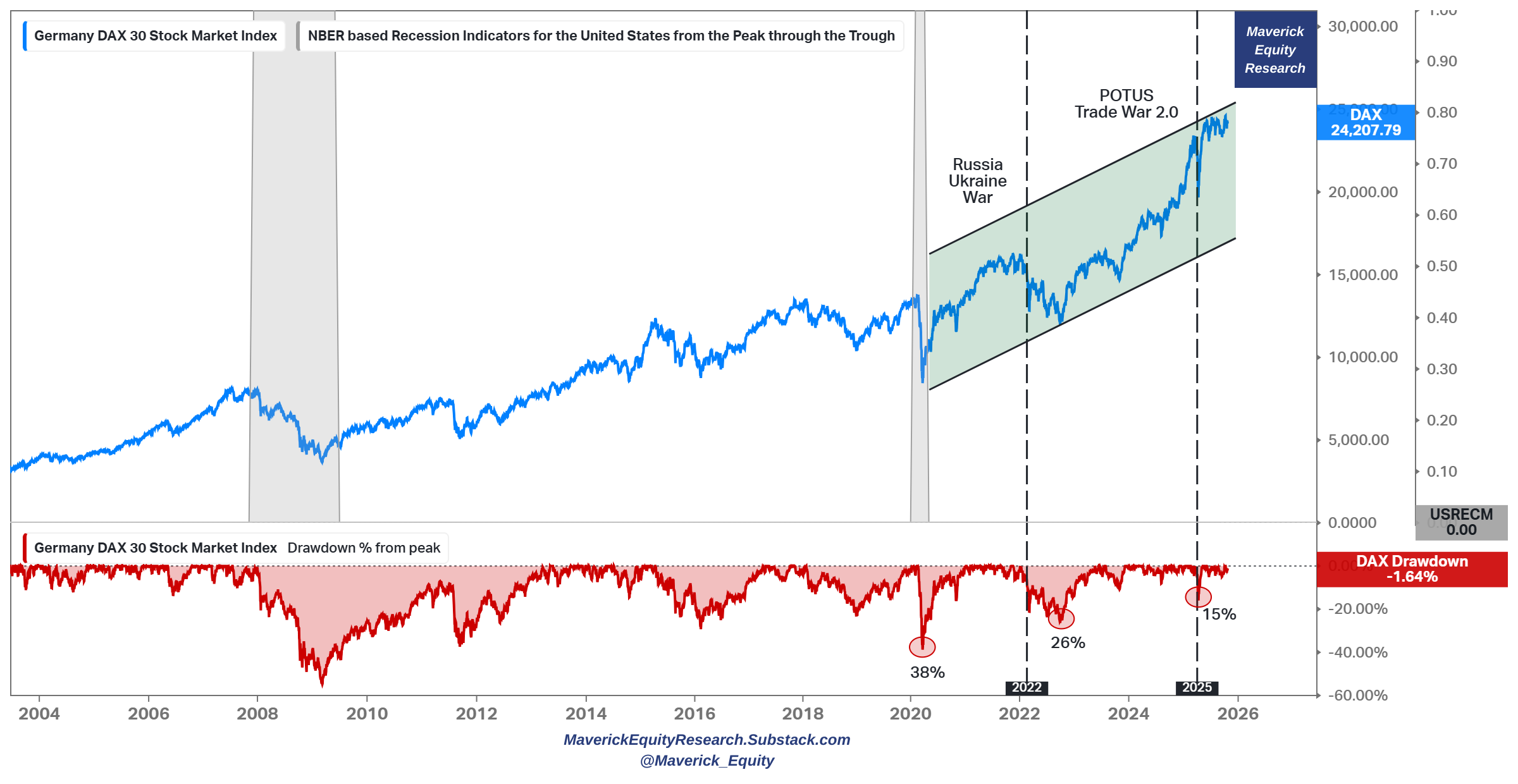
Germany DAX 30 Stock Index = a crazy good run:
👉 84% return = a ‘trendy trend’ since Covid 2020 (38% drawdown in red)
👉 65% return = since Russia-Ukraine War 24th Feb 2022 (26% drawdown in red)
👉 11.5% return = since POTUS Trade War 2.0 which started on the 4th of April 2025 Liberation/Tariff Day (15% drawdown in red)
A classic yet very real and practical example of:
👉 the stock market is NOT the economy, especially in the Germany case
👉 harvesting geopolitical risk premium works, especially if one waits a bit for the sell-off to go on for a few weeks/months & it works on any major stock index
👉= fresh invested capital during those times will compound way better (nope, impossible to time perfectly bottoms or tops)
👉 time to sell DAX for me: valid overall, the faster and the higher the recent gains = the lower future expected returns (the same the other way around: the faster and the bigger the recent drop = the higher future expected returns)
I will also write in the future 2 dedicated & complementary Maverick Special reports:
✍️ Harvesting Geopolitical Risk Premium Through The Recurrent Geopolitical Storms
✍️ Big Volatility & Drawdowns = Juicy Returns
Those will be about how one can actually take advantage of Geopolitical events, related volatility, drawdowns and turbulent times. Also, with enough skill, creativity, time and (costly) data available, I am thinking to develop a methodology (proprietary) on when is it the most likely & best time to actually harvest geological risk premium.
That would be delivered via a Maverick visual/dashboard for +10,000 words, a geopolitical Risk-On / Risk-Off indicator which would probabilistically signal when it is time to deploy new capital which shall compound way faster going forward.
✍️ Maverick Geopolitical Risk Harvesting Index (MGRH-I) ✍️
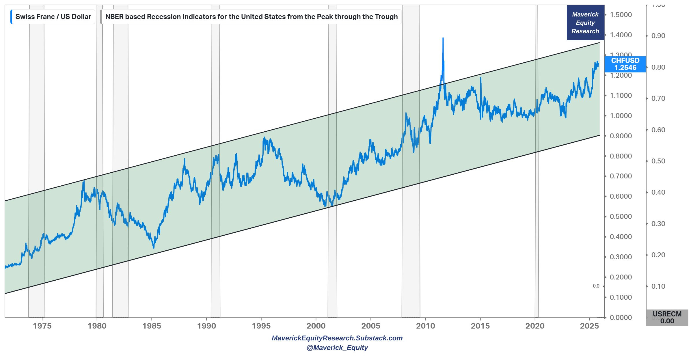
50 years mighty Swiss Franc vs U.S. Dollar (CHF/USD):
👉 that looks like a quite a ‘trendy-trend’ to me …
👉 why aren’t more investors looking into Swiss stocks? Ok, only around 200 listed, though very under covered which is good ...
👉 hence, I will also cover in detail quite some Swiss stock in detail in the future via the dedicated section: ✍️ Full Equity Research
👉 why? natural FX and cash flow diversifiers/hedgers + neutrality + fiscal discipline + innovation + SNB balance sheet + federalism & more ... ahh + chocolate 🍫 😉
📊 Bonus: U.S. ETFs massive inflows + Blackrock massive AUM 📊
U.S. ETFs inflows top $1 trillion for the 2nd year in a row! Flow baby flow!
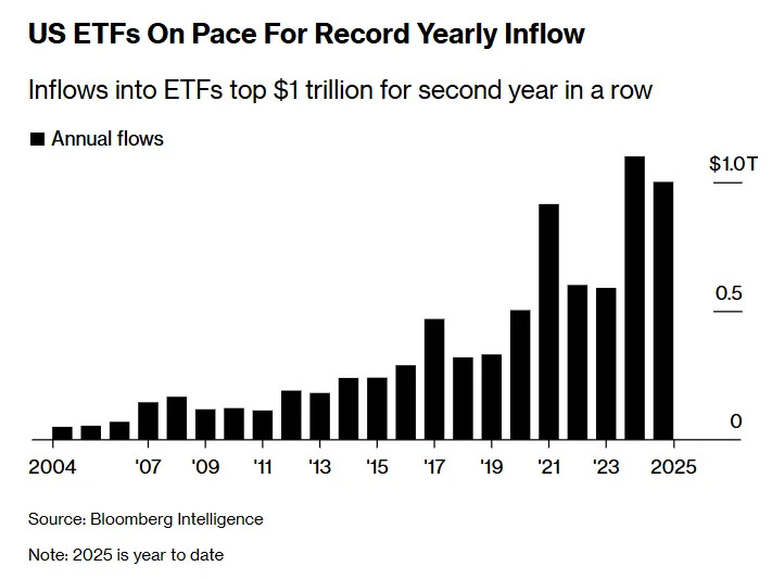
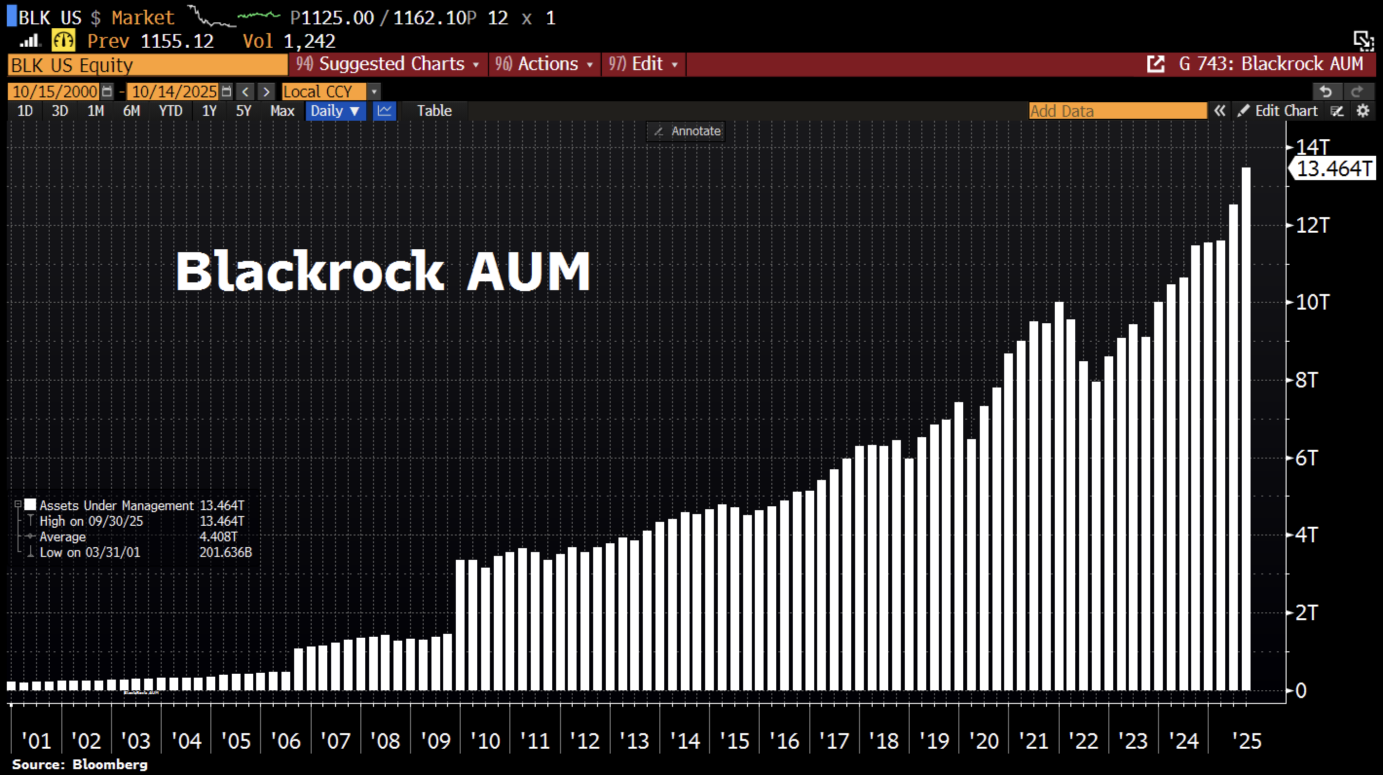
Blackrock is eating the world, and not AI? 😉
largest asset manager with a total Assets Under Management (AUM) hitting a record of $13.5 TRILLION as markets surged this year
recorded net inflows of $205bn in Q3 2025 as the company expanded its footprint in private credit and alternative assets
Maverick Charts 42nd edition done, 12 key charts with many insights!
You can check all the previous 41 editions in the Maverick Charts section!
Mission accomplished for me if the following resonates with you:
‘Hmm I never thought it that way’, ‘now that chart said a whole lot’, ‘now that chart was really interesting’, ‘now that is something new’, ‘now I got it!’, ‘you managed to turn something complex into something actually simple’
hence, if you got to see something differently, my approach gave you a different angle, it did help you connect your key dots, then here we all do well!
Research is NOT behind a paywall and NO pesky ads here unlike most other places!
Did you enjoy this by finding it interesting, saving you time and getting valuable insights? What would be appreciated?
Just sharing this around with like-minded people, and hitting the 🔄 & ❤️ buttons!
That’ll definitely support bringing in more & more independent investment research: from a single individual … not a corporate, bank, fund, click-baity media or so … !
Like this, the big positive externalities become the name of the game! Thank you!
Have a great day! And never forget, keep compounding: family, friends, hobbies, community, work, independence, capital, knowledge, research and mindset!
With respect,
Your Maverick 👋 🤝

Nice work/ sending to a friend
Great work! Really look forward to reading these every week!