✍️ Is the U.S. Stock Market in a Bubble? Maverick Special #8
S&P 500 valuation + are we in a bubble?
Dear all,
back after the ‘summer break’? That is great, I am back too & energised. Well, except for two weeks I never left. I was working in silence and ‘behind the scenes‘ (as always) on the future reports which will come with major improvements in all major areas: from structure, flow, insights to special metrics you rarely see, all are work in progress!
Step by step, with a big focus on quality & insights (not frequency, polarisation, news)!
Now let’s resume with a Maverick Special report.
With markets making all-time highs, margin debt higher and higher, people posting their great returns online (some are fake with simulated/virtual brokerage accounts & boosted by crazy leverage, some MEME stocks, some ultra high beta stocks), it is always natural to ask ourselves if we are in bubble territories. Hence, 3 charts on S&P 500 valuation, 3 on making the case for NO bubble and 2 bonus on S&P milestones.
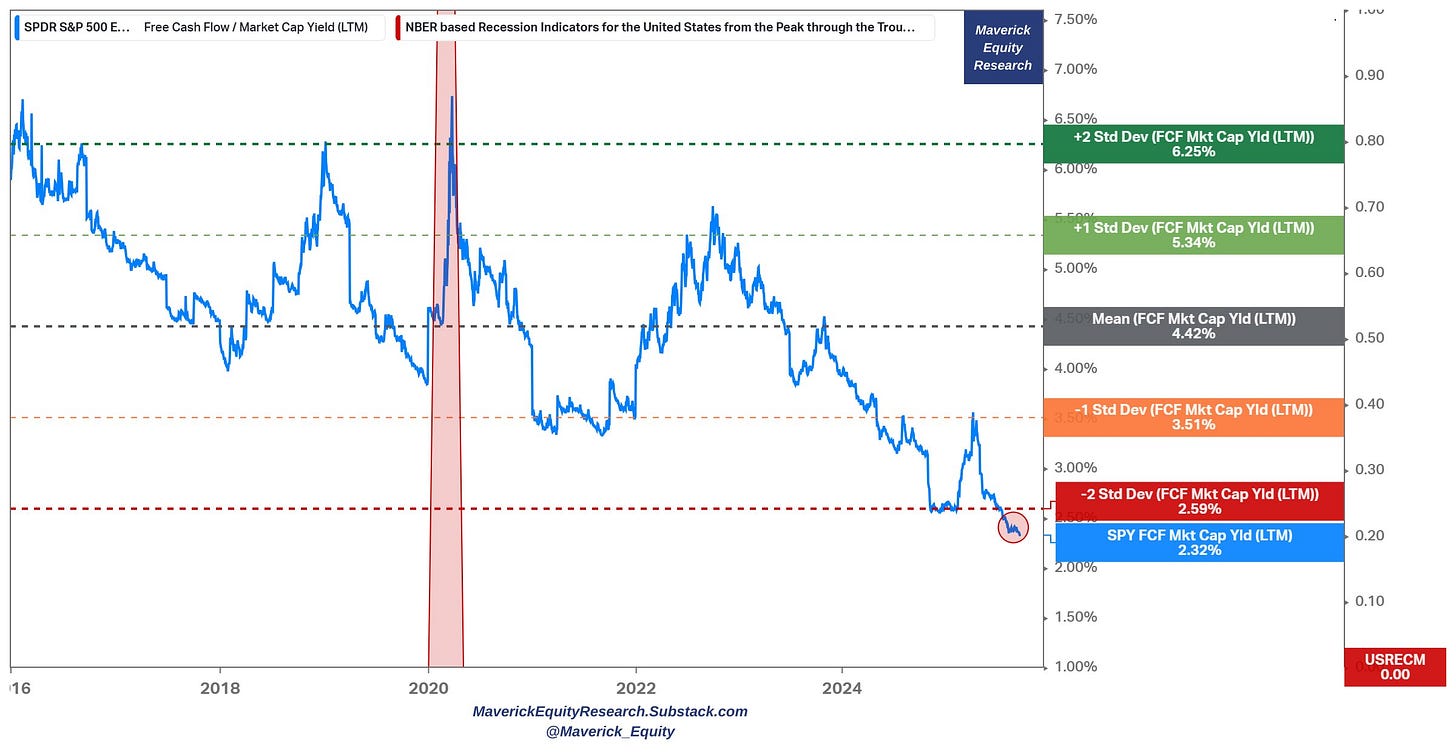
S&P 500 valuation via Free Cash Flow (FCF) Yield (quite a popular one as I did post it also on Twitter/X and it got +28,000 views):
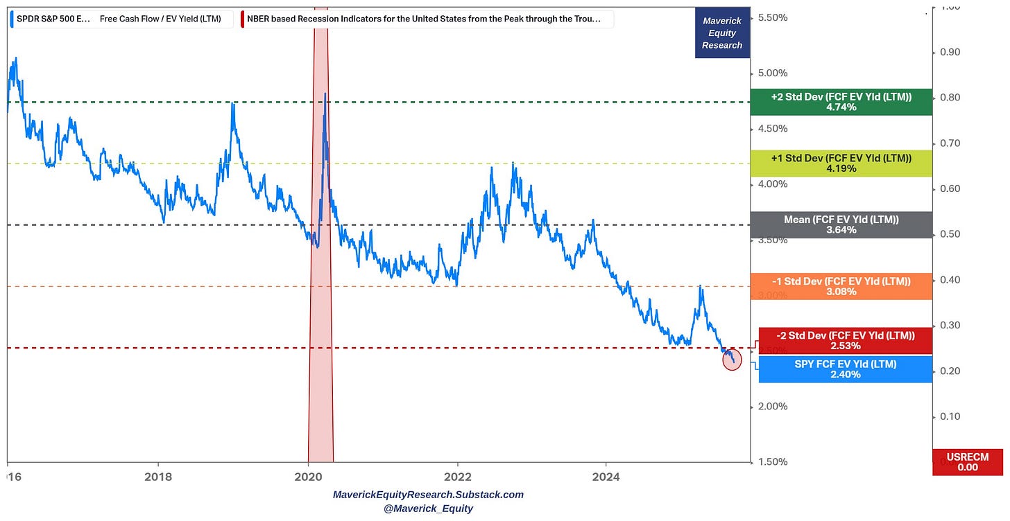
👉 S&P 500 (blue) trades even below -2 Standard Deviations (SD), and that is both on a Market Cap (chart 1) & EV basis (chart 2), 2.32% and 2.4%
👉 trading 90% higher than the 10-year average of 4.42% (market cap basis) and 51% higher from 3.64% (EV basis)
👉 quite a distance to reach only the -1 SD at 3.51% (market cap basis), and 3.08% (EV basis) which is still not cheap
👉 buying zone = rather within the 4-6% FCF yield range ... for example see when at +1 SD (2022 bear market), and even more so at +2 SD (Covid crash, 2018 bear market)
Maverick net takeaways:
an inverted metric a’ la Maverick in Top Gun 😉, meaning this shall be seen as a “Buy High, Sell Low” ... & ... “Sell Low, Buy High”
lack of margin of safety (MoS) these days ... and/or …
high price paid for value received “Price is what you pay, value is what you get”
S&P 500 Free Cash Flow (FCF) Yield on an EV basis/denominator:
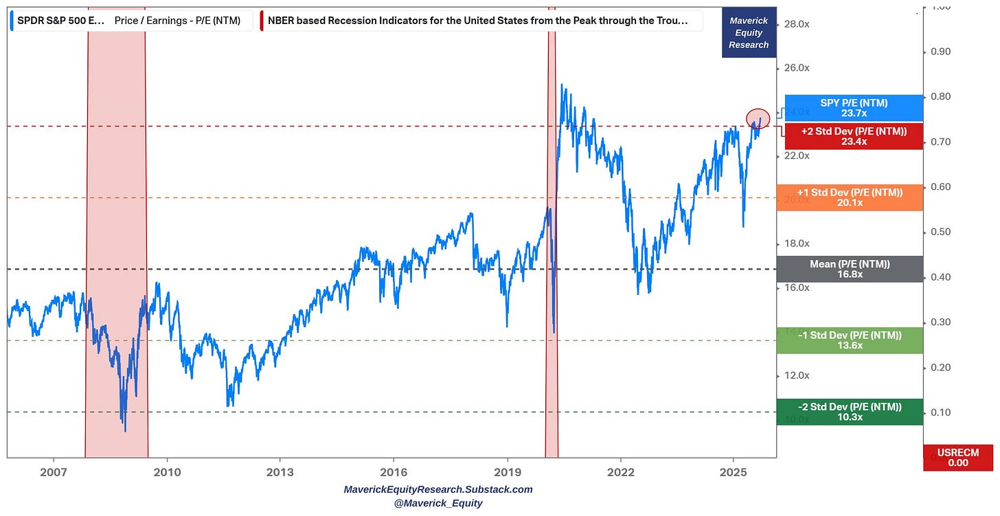
What about the S&P 500 valuation via the Price/Earnings (P/E) ratio?
Forward P/E = 23.7x (blue) with +14,500 views on Twitter/X:
👉 = above +2 SD (Standard Deviations)
👉 41% higher than the 20 year average of 16.8x
👉 = highest level since 2021 stock market mania (highest this century)
Now a great follow up question & chatter what I naturally hear a lot nowadays is:
Q: “So Mav, is the stock market these days fairly valued, overvalued or in a bubble similar to the 2000s Dot-com bubble? This is what we all need to know buddy!”
A: “Great question, though for a proper answer that would require a very thorough research backed up by serious data and rationale!”
Q: “All right, though for now can you pull up at least one of those Maverick Charts for 10,000 words? A bit like in the Joe Rogan podcast when he asks his technical producer for evidence: “Pull up that Jamie!“ … “Pull that sh*t up Jamie!“ … So, can you pull that up Mav?”
A: “Now that is kind of a funny way to put, and yes, I can pull that sh*t up!” 👇👇👇
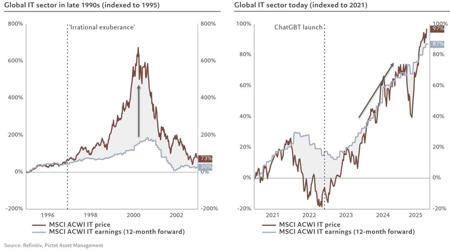
Global IT sector late 1990s (1995 indexed) VS Global IT today (2021 indexed):
👉 2000s = price went parabolic, but earnings not (left side of the chart)
👉 nowadays since 2022 ChatGPT launch: price went parabolic, earnings followed parabolically also … fundamentals matter, and that does say 10,000 words or more …
Maverick net takeaway:
with a 97% price return VS 87% earnings, there is a current gap of 10%, and I will monitor and update you as we move forward via my future reports - until then and for now, it is very hard to say that we are in a bubble!
therefore, via the typical Maverick-esque fashion, bringing you here insight via evidence and delivered with clarity, calmness, coolness … enjoy! (also this chart had decent views on Twitter/X with +72,000 views)
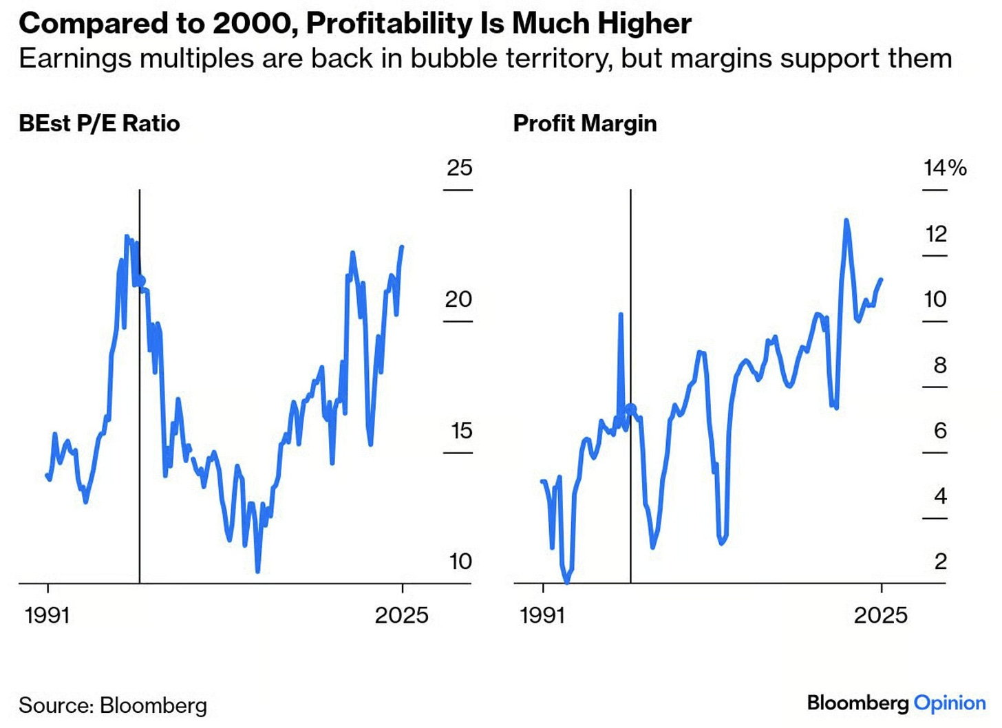
A complementary view also via Profit Margins:
👉 compared to 2000, this time margins support the high earning multiples
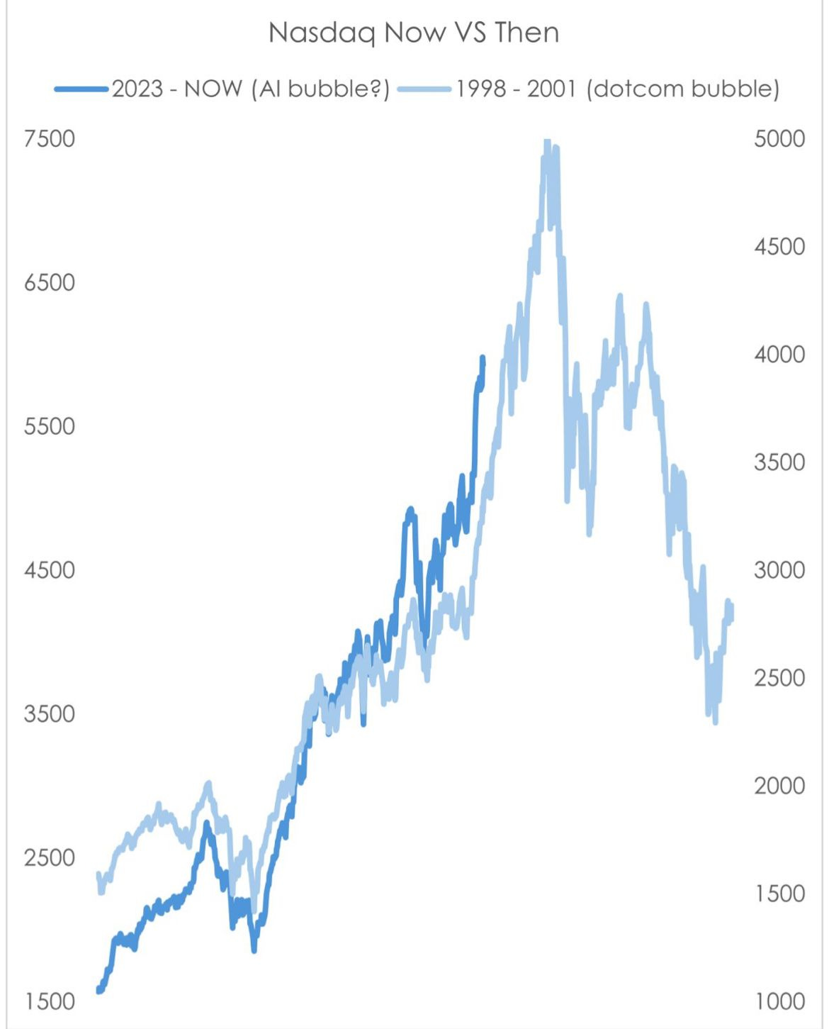
On this key topic, so many wrong charts circulate around and spread like wild fire, yet don’t say much or are wrong. But they ‘work’ to attract eye-balls for ads or for even worse reasons. Do you want an example? There you go: I did pull that sh*t up too! 😉 👇Now it isn’t my style to name call or ridicule others, so the source won’t be mentioned, but I can say that just this chart had +500,000 views, and many more out there …
Nasdaq Now (2023-nowadays) VS Then (1998-2001):
👉 while it is a nice analogue, a beautiful correlation & chart, what does it tell you?
👉 1st reactions are many along these lines: ‘oh wow, that is crazy, it is a bubble!’
Maverick net takeaway:
The Global IT sector via MSCI ACWI IT is not exactly the Nasdaq-100, but I think quite good proxies to each other - hence, which chart you ‘like’ more? The one below, or one above? where do you lean more into?
there are pockets of the market that start to exhibit more and more of a bubbly behaviour (I will show them with the next Maverick Charts edition), but until then, overall I do not think we are in a bubble which would cascade with a lot of negative effects and spiral down heavily
After answering ‘Is it a bubble or not?’, what about regarding the stock market being:
1) highly undervalued
2) undervalued
3) fairly valued
4) overvalued, or
5) highly overvalued?
Well, that is quite a different ballgame which requires very solid research. That will also be answered via my future two distinct S&P 500 reports, and materially improved in all areas: structure, flow, insights and special metrics you rarely see:
✍️ S&P 500 Report: Valuation, Earnings, Fundamentals & Special Metrics
✍️ S&P 500 Report: Performance, Sentiment, Seasonality, Technical Analysis
📊 Bonus: Milestones of Global Stocks and the S&P 500
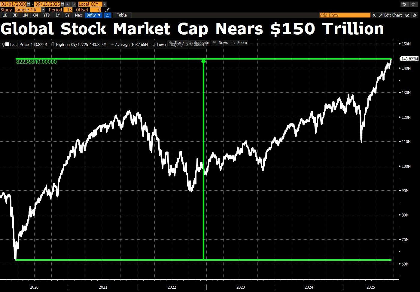
Global Stocks milestone = close to the $150 trillion mark:
👉 +31% since the April 2025 ‘Trade War 2.0’ low, for a +$34 trillion in added value
👉 +137% by adding +$83 trillion in value since the 2020 March pandemic bottom
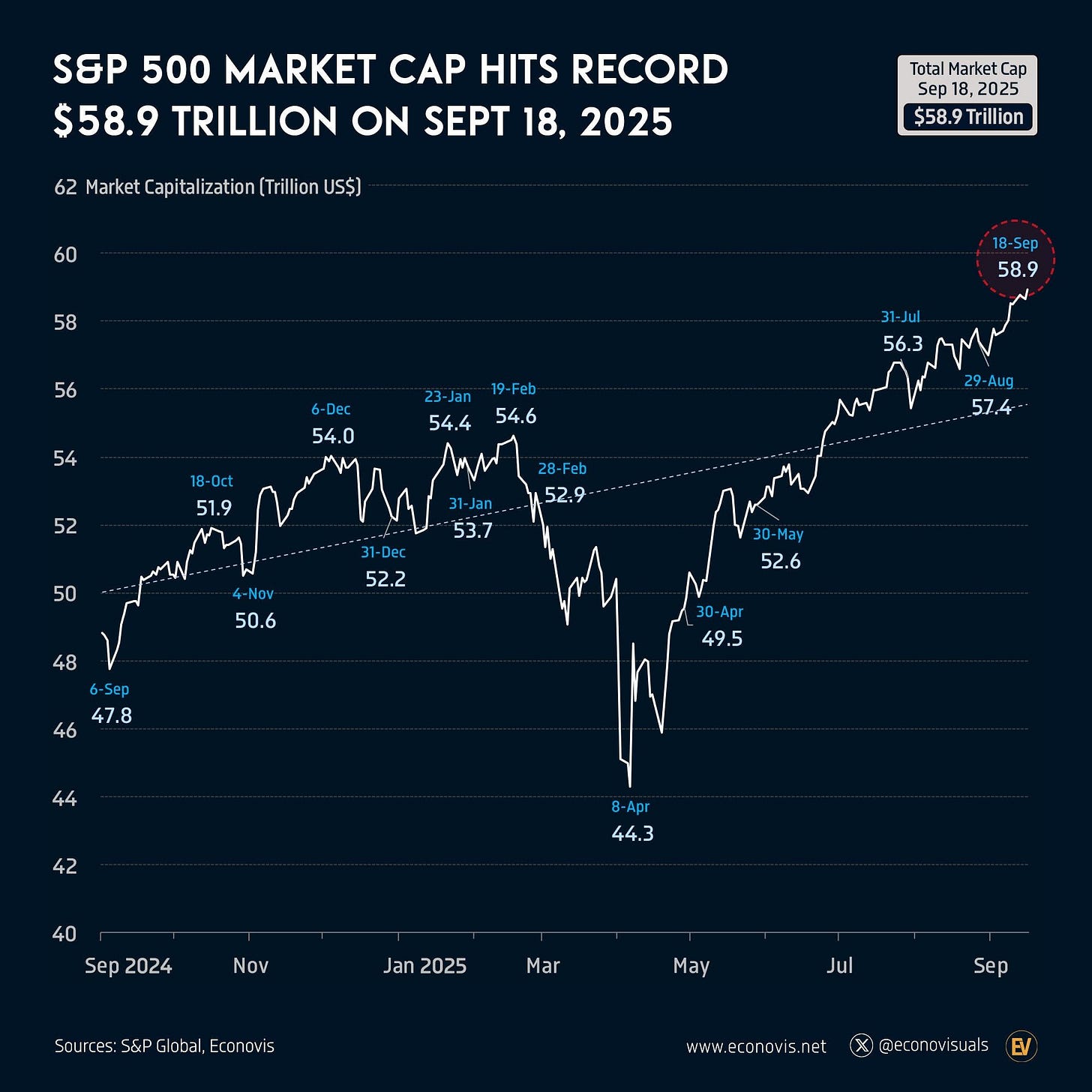
S&P 500 milestone = close to the $60 trillion mark:
👉 +12.8% in 2025 alone and adding $6.7 trillion
👉 +8.7% for an extra $9.3 trillion from the same date in 2024
And that was with the Maverick Charts 39th edition, 7 key charts with many insights! You can check all the previous 38 editions in the Maverick Charts section!
Research is NOT behind a paywall and NO pesky ads here unlike most other places!
Did you enjoy this by finding it interesting, saving you time and getting valuable insights? What would be appreciated?
Just sharing this around with like-minded people, and hitting the 🔄 & ❤️ buttons!
That’ll definitely support bringing in more & more independent investment research: from a single individual … not a corporate, bank, fund, click-baity media or so … !
Like this, the big positive externalities become the name of the game! Thank you!
Have a great day! And never forget, keep compounding: family, friends, hobbies, community, work, independence, capital, knowledge, research and mindset!
With respect,
Mav 👋 🤝



Missed this one when it was released! Thanks for re-sharing!
If you wish to answer the question: "are we in a bubble", the best way is to read the book "Extraordinary Popular Delusions and the Madness of Crowds", Mackay, 1849. The first part is a survey of financial bubbles which happened before 1849. The rest of the several hundred pages is about the Crusades, Alchemy, and all sorts of nonsense that people believed in.
It is from 1849, but written in surprisingly modern style.
The "abridged" versions are usually just the financial bubble stories, which is fine for this purpose. In the end, charts won't help. It's a "vibe" thing. Reading these stories gives you a lovely sense of exactly what it is like to live through a bubble.
https://www.amazon.com/Extraordinary-Popular-Delusions-Madness-Crowds/dp/1539849589/